Every page
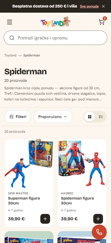
Home, collections, product pages, cart, checkout and the information pages.


 igracke.meLive
The full eCommerce setup for a toy brand: every page, every catalogue item, every back-office setting and the third-party apps, all connected from day one and set up for what the store needs.
Built with AI coding agents. Directed and checked by me.

01 · The starting point
Products, prices and stock live in the ERP, the back-office system behind the shop. The new store had to run on that data and keep the search traffic the old site had built up.
02 · What I did
Home, collections, product pages, cart, checkout and the information pages.
Moved from the ERP into Shopify, filed under Shopify’s standard categories and named the way customers search.
Payments, tax, the checkout, the store policies and the emails the store sends.
Every old address points to the right new page, or was deliberately retired, so search traffic carries over.
Checkout, payments and tax. A test order showed up correctly in analytics.

03 · In numbers
These count the work, not the results. It’s too early for those.
04 · Connected
Each one set up for what this store needs.

Email. The signup and the flows are set up, and the sending domain is verified.

The product feed, so the products can show in Google Shopping.

Connected to the store and to Merchant Center.
Visits and orders tracked, checked with a test order.

Verified, with the sitemap submitted, so Google can find every page of the new store.
The back-office system behind the shop. Prices update in the store every day.

Product reviews, shown on the product pages.
Card payments. No Shopify Payments in Montenegro, so the store uses this local gateway app.
05 · Where it landed
Results will be added once there are a few months of real orders to measure.
Free one-page review
Send your store link or your idea. You’ll get one page back: what I’d fix or build first, and why. Written by me, and free.
Nothing opened? You may not have a mail app set up. Copy my address and write from anywhere.